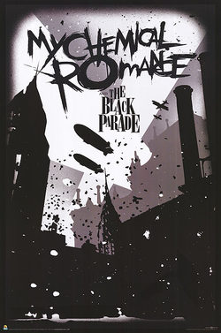
I chose this My Chemical Romance poster because I think it has an interesting design. I like the general style of the poster. It's sort of a messy logo to show I guess intensity. They used the font for the "Black Parade" text to give it a sort of old or worn out feeling. They kept the colors black and white to do the same. It sort of reflects the feeling of that album. The text is in a generally open area of sky around and above skyscrapers and blimps and still works together with the background.
I would title this Danger Days after the album this picture came from. I tried to make Gerard look pretty cool. I don't exactly know what the feel of the drawing is. I learned more about adjusting the colors and opacity of the drawing tool and how to use it properly. I guess I would like to work more on my technique in general. About shading and how to draw clothes better. I think I did a decent job with shading.
I guess I would title it winter wonderland or something like that. I tried to make it a happy mood. Like reliving memories and how I perceived them. I guess it's about the way kids see the world. I make everything more centered around snow and decorating the trees. I don't really know what the most successful part of the picture is. To me it shows how we all used to perceive things when we were younger.
|
Archives
December 2015
Categories |